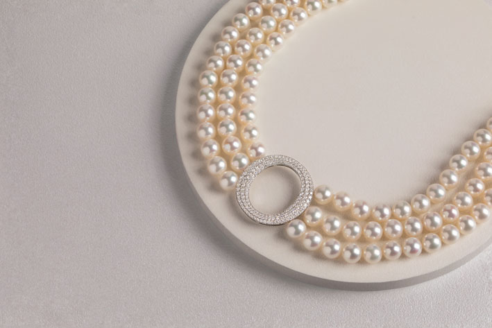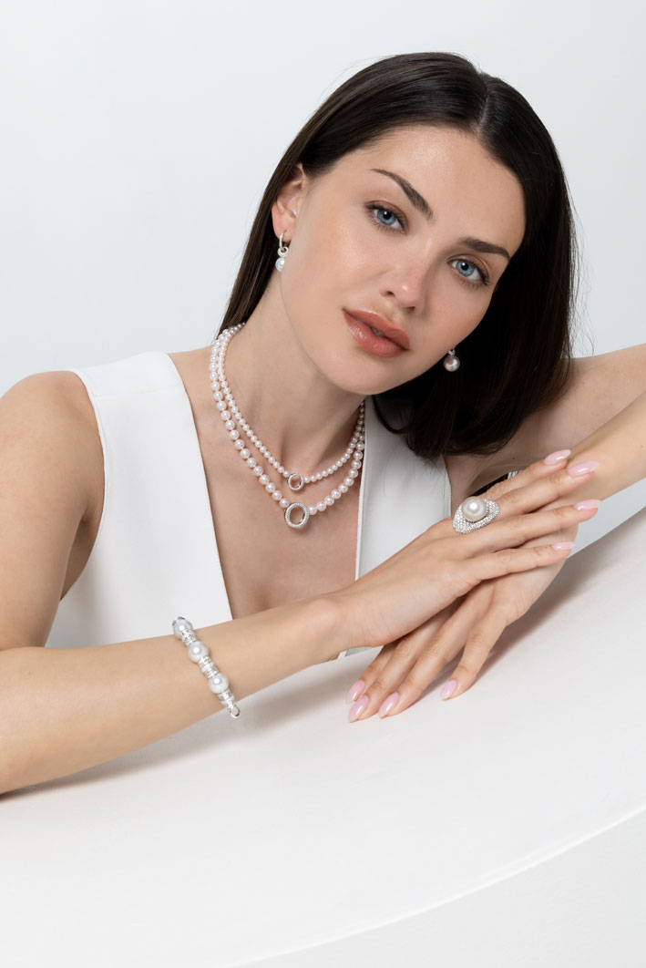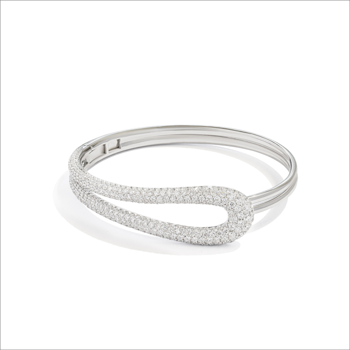
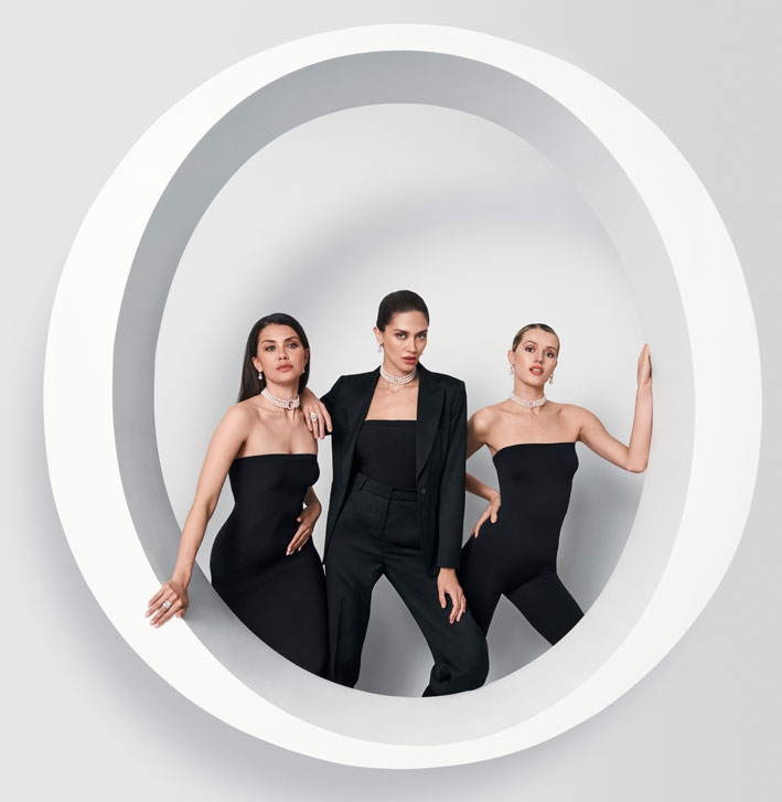
Yoko London presents Yoko Icons, a new campaign that brings to life the sculptural spirit of the house’s most iconic symbols: the Y and the O. At the heart of the campaign is O by Yoko, a new collection that encapsulates the essence of Yoko London, inspired by the letters of the alphabet that define the brand’s name. The collection transforms traditional pearls into symbols: the circular strength of the O and the angular elegance of the Y. Together, they form an instantly recognizable and modern design. The motifs are considered visual signatures of the brand’s identity.
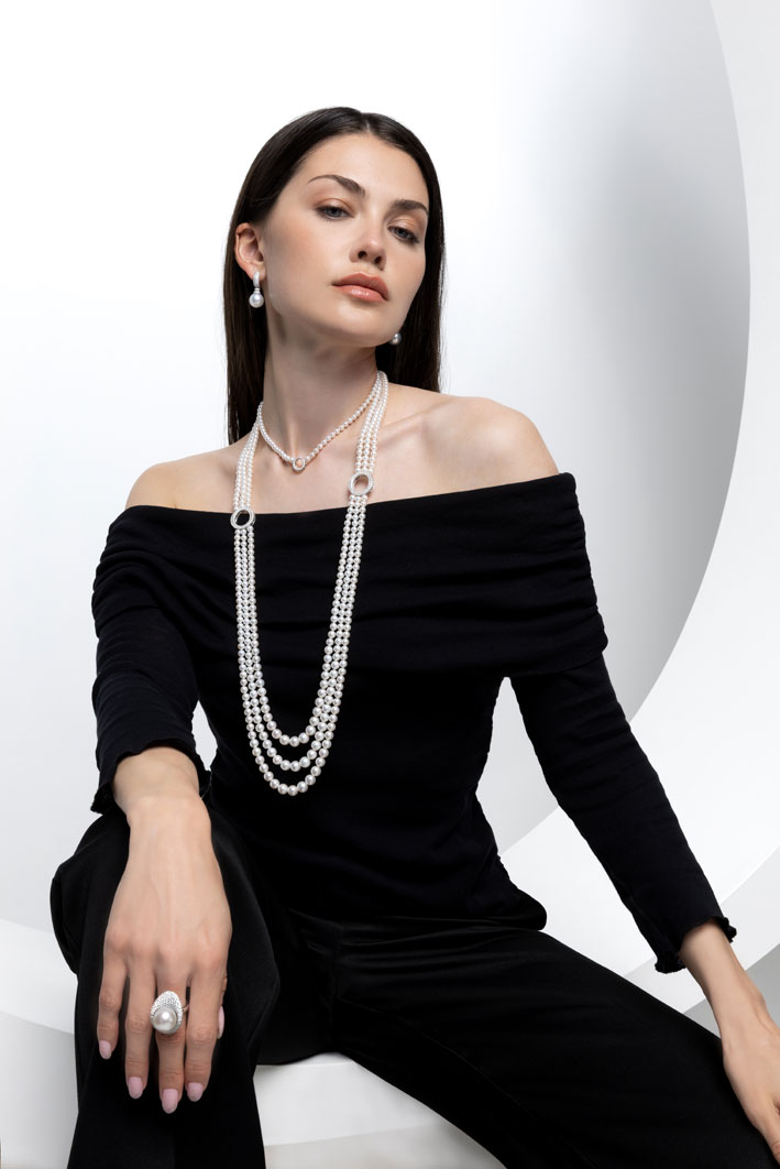
A central element of the campaign is a life-size sculptural O, designed to echo the signature motif that runs throughout the collection. Shot in interaction with the models, it becomes both frame and form, a visual statement and a symbol of the collection’s immersive and defining spirit.

The Yoko Icons campaign is a celebration of modern femininity—self-assured, confident, and impossible to ignore. With O by Yoko, we’ve distilled the very essence of our identity into powerful shapes that speak for themselves. The O. The Y. Every angle tells a story.
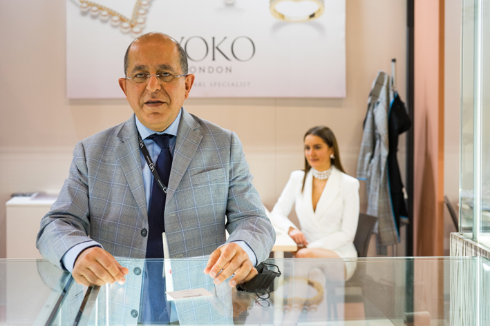
Michael Hakimian, CEO of Yoko London
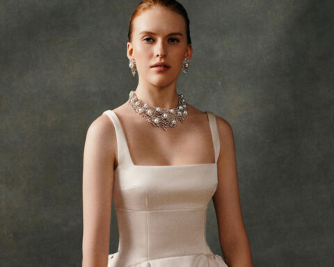
The Yoko Icons campaign features contrasting images shot with a sculptural style and dynamic movement, capturing a world where pearls meet avant-garde elegance.