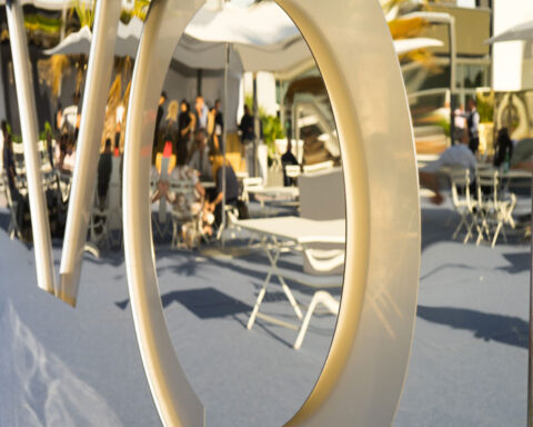
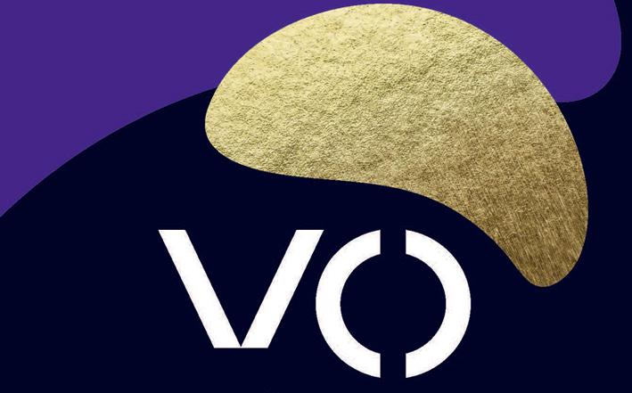
Ieg changes VicenzaOro’s look with a gold leaf on a purple background. That’s why ♦ ︎
With a superficial glance reminds of a chips, round, golden and very tasty: ones that are sold in packages. The new symbol of VicenzaOro, however, obviously alludes to something else: a gold leaf, to the goldsmith’s skill made in Italy and, not least, to a change in graphics with respect to the management of Marzotto & Facco.
Just a few days after postponing the announced listing on the Stock Exchange (“we wait for a more favorable moment”), Ieg, the company that manages, among other things, the Vicenza trade fair announces the change in image.

Farewell to the poster vaguely styled Magritte, here is the new face studied by FutureBrand, a brand consulting company, to which Ieg has entrusted the task of rebranding: read gold leaves flying on a dark blue and purple background.
“The collaboration with FutureBrand has allowed us to witness the evolution of an important event like VicenzaOro, which leaves the geographical territory and is positioned among the most important business events in the world, to dialogue with operators across the entire supply chain in the sector of jewelry “, comments Marco Carniello, director of Ieg’s Jewelery & Fashion Division.
“Italy is the country of excellence and it is above all in the luxury and design sector, so collaborating with a brand like VicenzaOro has been a challenge for us at a high strategic and creative rate”, adds Lorenzo Corengia, associate account director of FutureBrand. ”
The new brand identity will make its official debut at VicenzaOro January (Vicenza, 18-23 January 2019), the first appointment of the reference year for the sector.